Heritage designs the future. Postsparkasse – design by Otto Wagner. 1905
In this time of everything being put on pause, we would like to take the chance to tell you, week after week, about our heritage through projects that have marked our history and contributed to defining the grammar of modern design. Short pieces in homage to our stylistic heritage linked to the introduction of the bending beech-wood processing technique which marked the crucial transition from craftsmanship to industry. A space for reflection on the value of the past as it is projected into the future.
Our first appointment is with one of our most iconic collections, the Postsparkasse by Otto Wagner, the great Austrian architect and prophet of 20th-century architectural style.
A fascinating, optimistic and impetuous character, as revolutionary as the building he designed for the Postsparkasse, the Austrian Postal Savings Bank in Vienna, one of the most interesting examples of functional Secession-style architecture.
An innovative project for the time for which, without decorative formalisms, Otto Wagner applies artistic criteria to a building with a profane function, marking a break with the past, also underlined by the use of reinforced concrete as a construction material. The building nicknamed “box of nails” by the Viennese is characterised by the simple solidity of the facade decorated with marble and granite slabs. The aluminium nails that seem to attach the slabs to the façade are actually only a decorative element.
In contrast to the façade, the interior, especially the entrance hall and the Salone degli Sportelli (Hall of the Doors), is more airy thanks to the use of glass and steel with structural parts and technical systems which at the same time become stylistic elements, an expression of the architect’s motto: “Art is only the result of necessity”.
For the first time, a choice that later became common practice, Wagner placed the doors to the public in the hall in the centre of the imposing building, a declaration of a great company working in the service of the people. Functionality and aesthetics also guided the design of the custom-made furniture for the bank. Wagner was asked to find a solution in order to be able to identify the skills and levels of responsibility of the employees from the furniture itself.
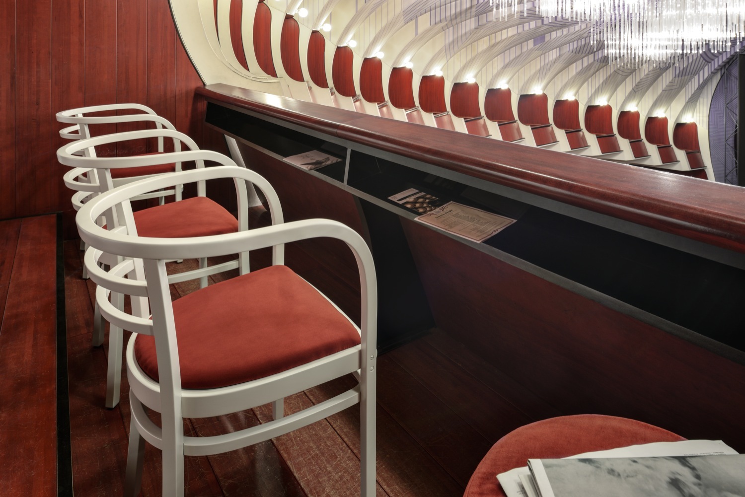
By designing a seat using elements of others already in production, following the attitude typical of Michael Thonet’s legacy, Otto Wagner proposed different finishes for his armchair according to rank in the hierarchy, from clerk to official. Four variants: mahogany finish with red suede leather padding, embellished with brass feet for the general manager and his deputy; grey armchair with green suede padding, feet and foils applied to the aluminium armrests for the managers of the various departments; same seats but with higher aluminium feet and wooden seat for the library; small armchair with wooden seat without metal parts for the smaller offices.
Another special feature of Postsparkasse, a breakthrough in the tradition of curved wood, is Otto Wagner’s choice to introduce for the first time the use of square rather than round cross-section processed wood, designing a rigorous profile. A process resumed after more than 100 years in various products from the contemporary GTV collection, from the Hideout lounge chair by Front to the Promenade sofa by Philippe Nigro and the headboard by Storagemilano, which pays homage to Ottow by using his name.
Since 2002, the reissue of the Postsparkasse armchair in white and black in the version originally intended for the library together with the matching stool has been included in the Gebrüder Thonet Vienna catalogue. An archetype of style renewed in 2018 on the occasion of the centenary of Otto Wagner’s death with the special edition with copper details and cladding of the Maharam collection with decoration by Josef Hoffmann, a pupil of Otto Wagner among the founders of the Viennese Secession.
To be continued.


